BACKGROUND
OnDemandKorea (ODK) is a leading Korean content streaming platform. However, after 10 years without updates, the platforms' UX/UI became severely outdated and difficult to operate due to varying designs on different devices.
Recognizing the need for modernization, ODK initiated a major rebranding for all OTT products.
Recognizing the need for modernization, ODK initiated a major rebranding for all OTT products.
MY ROLE
As I joined the team during the design phase, I maintained the company's TV UX/UI direction while adhering to the PRD. I updated the design for 6 new features to match other devices (website and moble apps). I conducted user research, aided usability testing, unified design system, and improved design documentation.
PROJECT OUTCOMES
- TV apps that are visually cohesive with a consistent app experience across 7 platforms (Apple TV, Roku, Android TV, Fire TV, Samsung, LG, ODK Box)
- Optimized Design System and design documentation that sped up cross-functional collaboration.
- Usability testing task success rate is 88.04% and average subjective score is 4.46 (out of 5).
- 7,000+ downloads
- Optimized Design System and design documentation that sped up cross-functional collaboration.
- Usability testing task success rate is 88.04% and average subjective score is 4.46 (out of 5).
- 7,000+ downloads
TEAM
4 Product Designers, 4 Project Managers, 5 Visual Designers, 3 Teams of Engineers, 3 QA, 1 Business Analyst, 3 Marketing
Timeline
8 months: App release
4 months: Post-launch improvements
4 months: Post-launch improvements
TOOLS
Figma, Adobe CC, Miro, Jira, Confluence, Slack
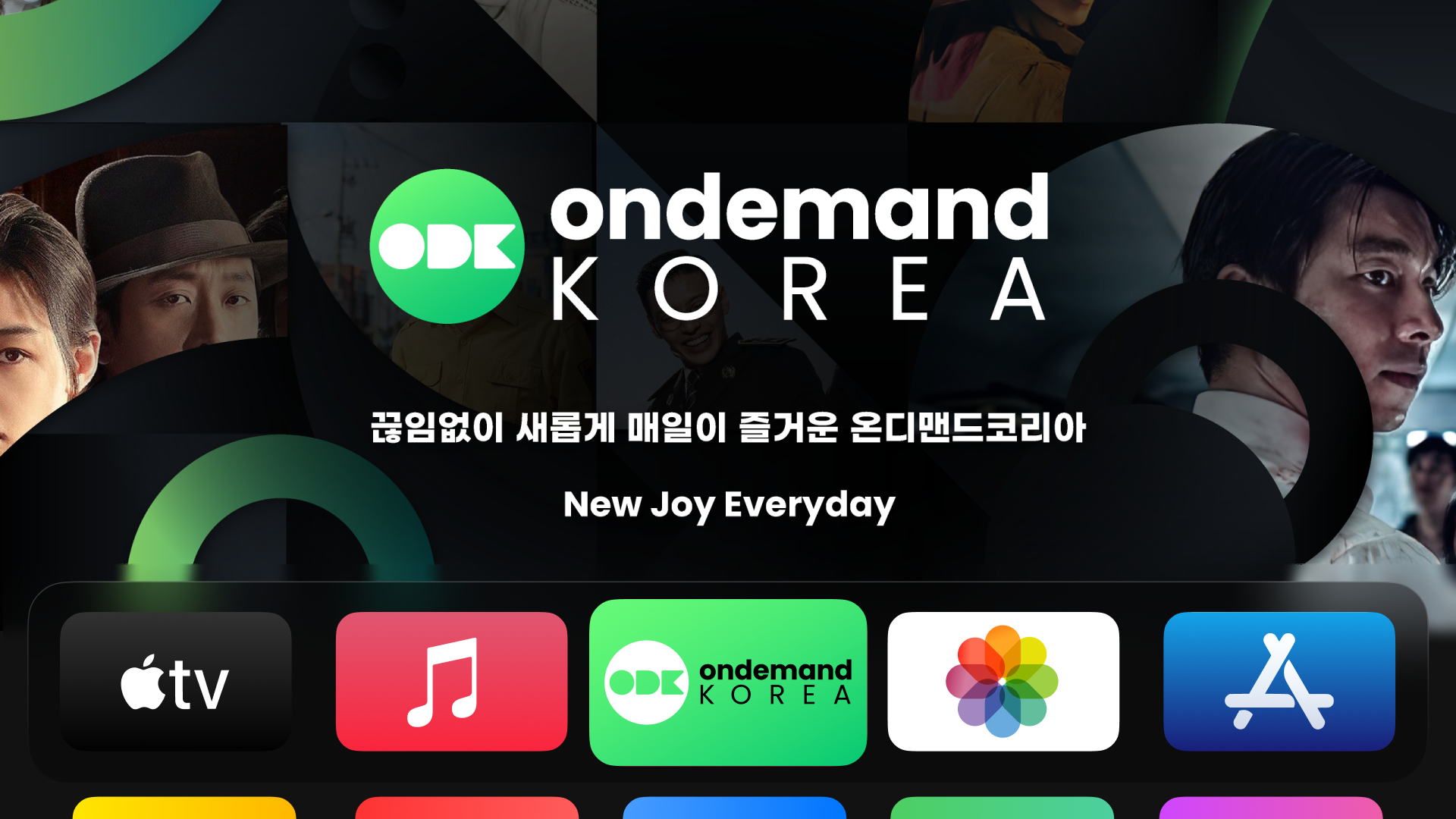
Overview of new OnDemandKorea TV platform. Previously, all ODK TV apps had different designs and no branding since they were using the platforms' respective default design.

Solution
Home
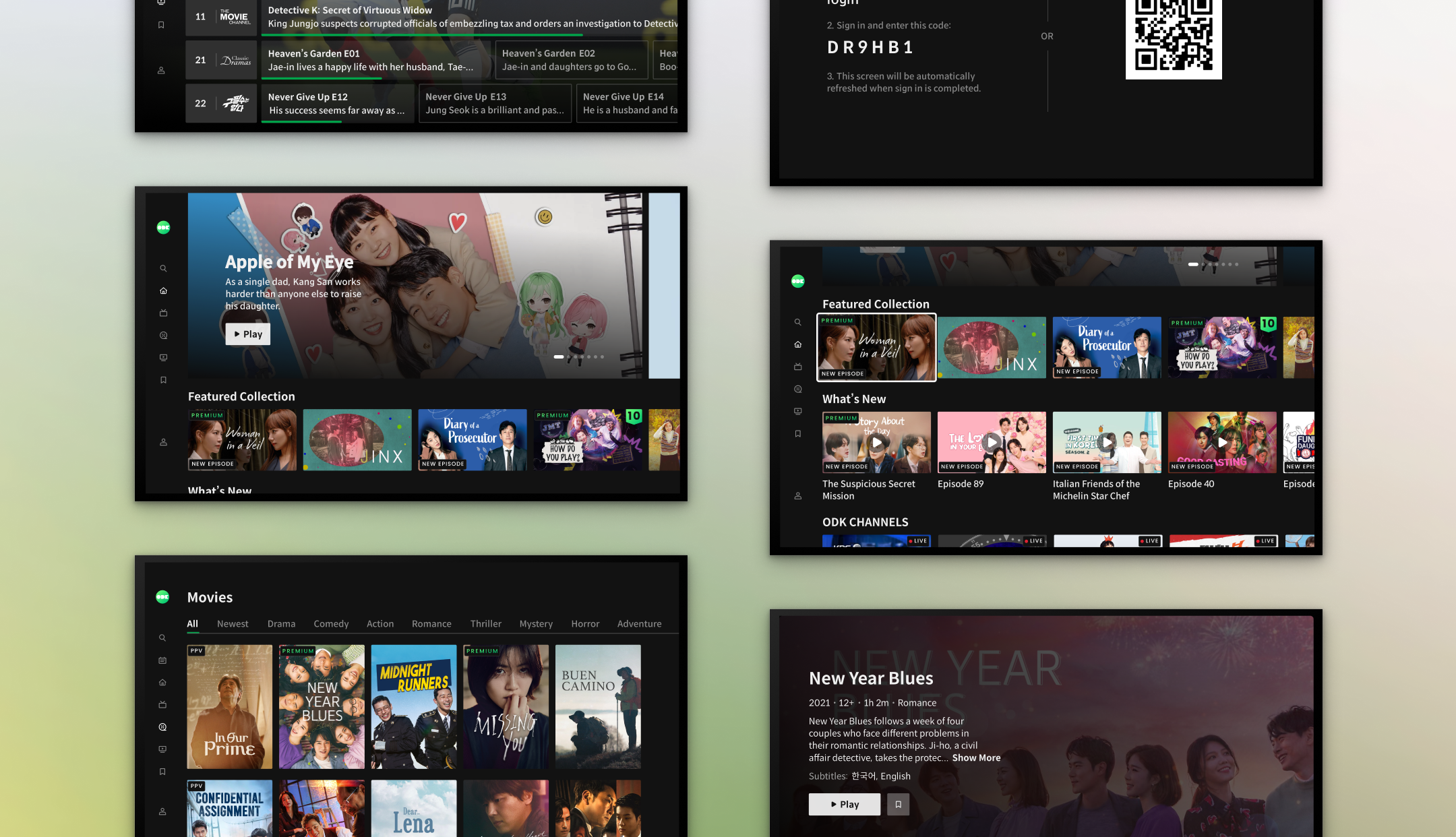
The home screen serves as the main browsing feature. As it was difficult for users to see their current state when browsing on Apple TV, I made the thumbnail and outline bigger. I also displayed the previous program to make it easier to know where they are.


Video Player
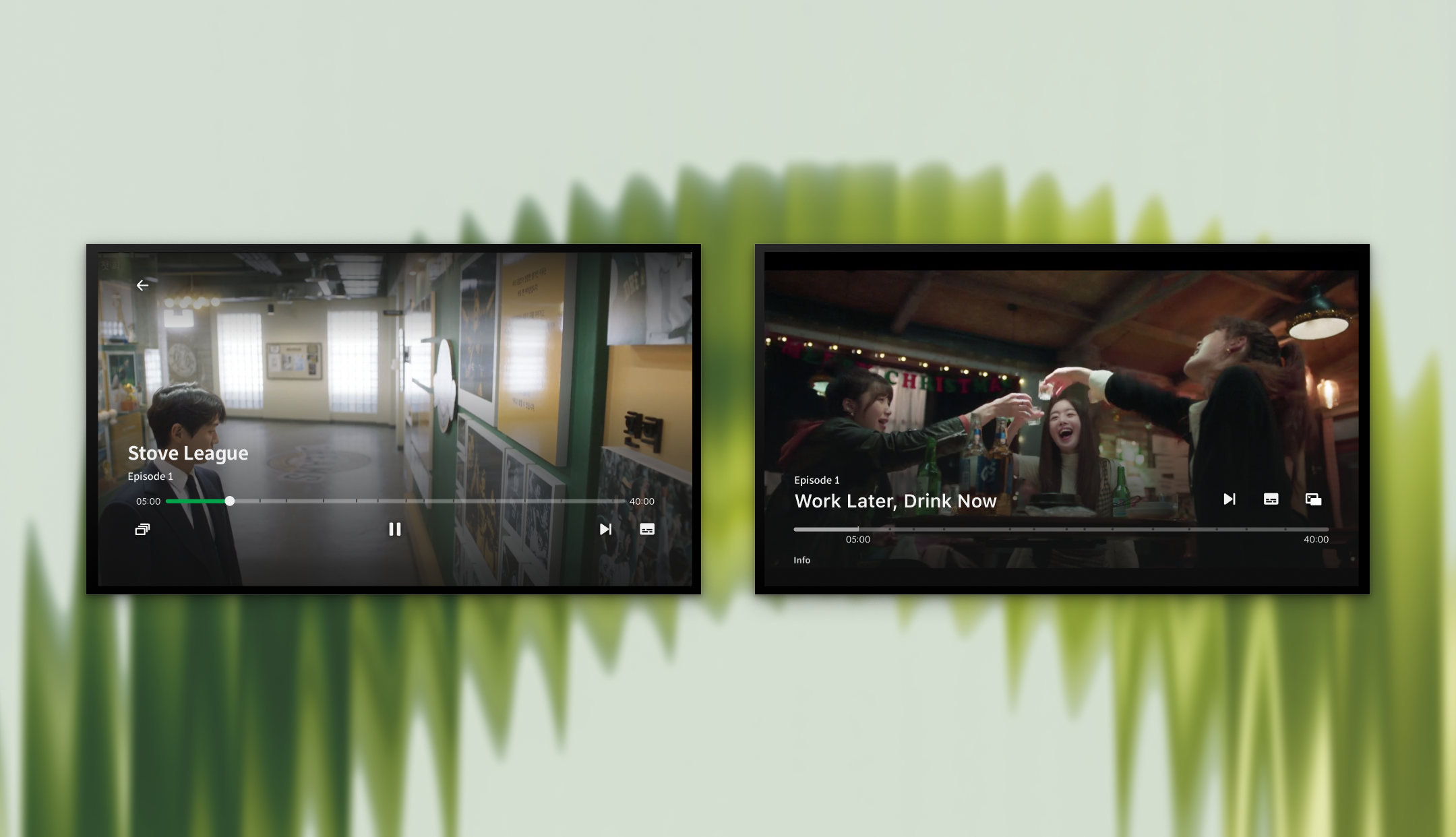
The video player is where users can watch content. I enhanced the TV remote behavior and modified its initial focus state to be on the progress bar. Apple TV posed difficulties when using the same UX/UI, so we had to use Apple's default tvOS UX/UI.
Program
Program is where the main meta-data and other information about the show or movie are located. I focused on making the font and background easily readable.

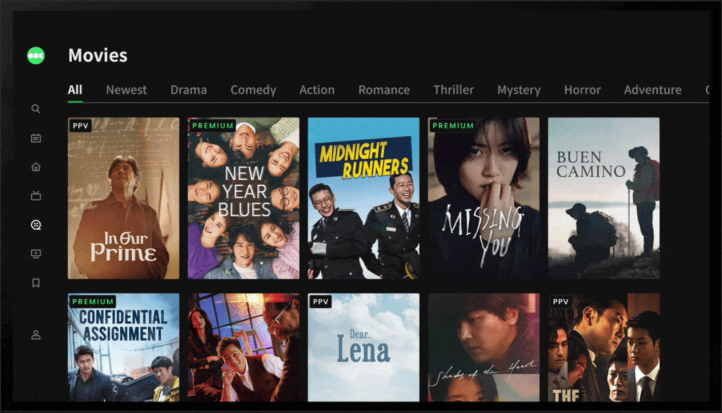
Category
Category separates TV shows and movies and allow users to filter based on genre. In order to minimize remote strain, I focused on making it easy to skim through content just by using the arrows on the remote.
Live TV Guide
ODK Channels is the Live TV feature. I focused on making it appear more modern and easy to browse through different channels while also watching their current program.
Design Process
Short timeline, quick iterations, and constant changes
Multiple features, quick iterations, and constant ideation and feedback: this was a fast design process with limited time. Despite having a base design layout for the redesign, I prioritized conducting user research, understanding industry standards, and working closely with PMs and Engineers to further improve the base layout and consider all changes necessary.

Operated with the Double Diamond Design Process where the designs were constantly being iterated upon
User Research
Users find it painful to use the platform due to tiring remote behavior and cluttered UI
To save time, I consulted online articles, company's previous user research, and quick user interviews to identify common pain points associated with watching ODK and TV. As 64% of our target audience are between 30-67, I focused on them.

Our older audience finds it tiring to use the remote, especially since it's difficult to find content they're interested in.

Our younger audience finds the interface lackluster and disorganized, which makes them uninterested to find new content.
Competitive Analysis
Market research revealed trends amongst top streaming platforms
I wanted to gain a comprehensive understanding of the latest trends in TV user interface design before I started working on my design. As a result, I analyzed at least 6 competitors' designs for each feature and identified potential areas for improvement.
Some features that I looked into from other competitors
Problem SPACE
As a result, the main problem space was:
How might we offer the optimal laid-back TV experience that is remote-friendly and easy to discover content?
IDEATION & Iteration
Multiple iterations to enhance clarity of the app
Since there was already a provided base layout approved by PMs, I focused on improving the little details and fixing technical complications that might arise from the design throughout the process. I focused on making the UI more clear with concise labeling along with specifying the remote behaviors to be similar with other apps. Each feature went through at least 4 rounds of iterations before delivering to PMs.
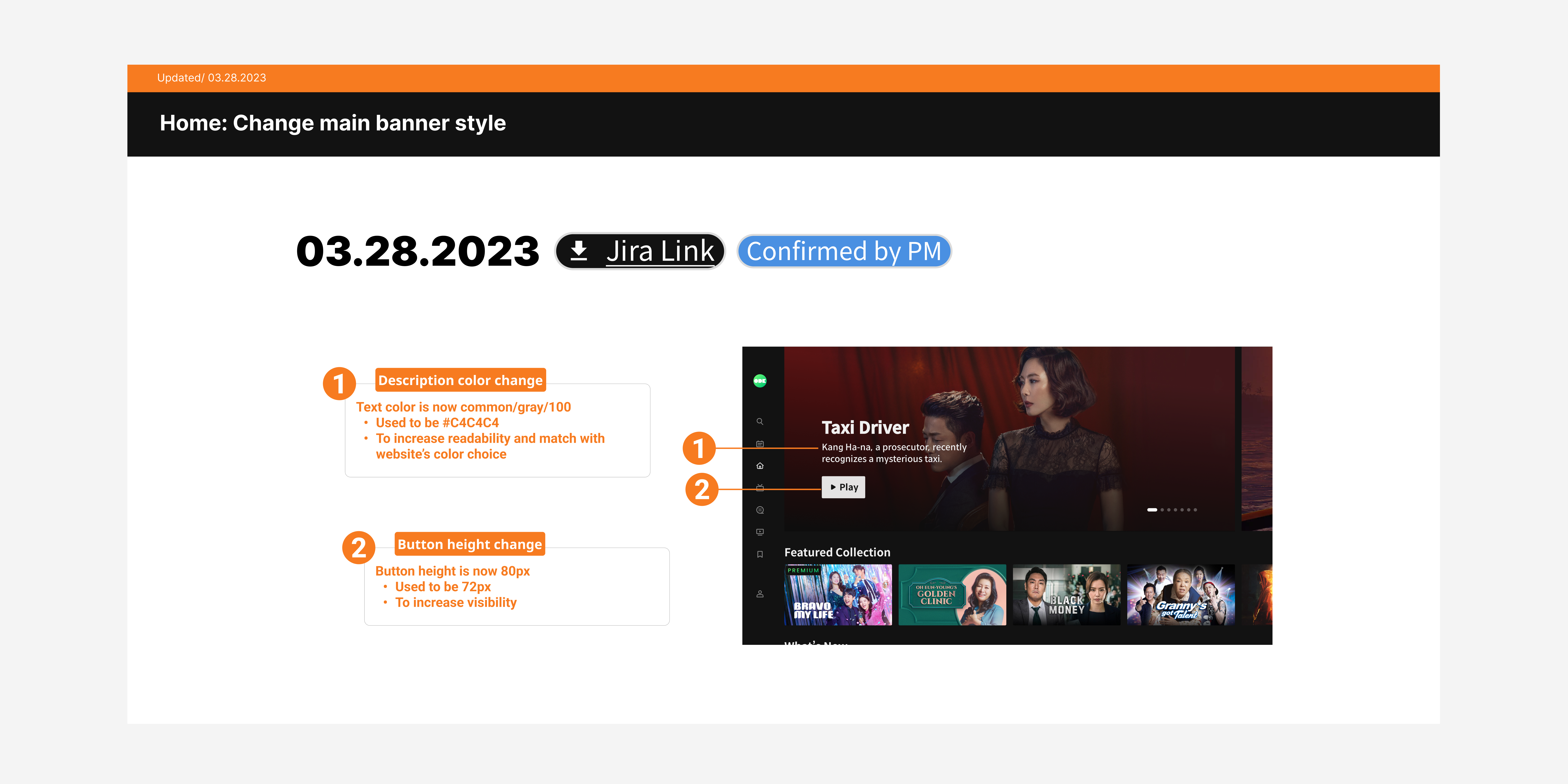
Home: Added a main banner for promotional content. Simplified UX for dev team by keeping progress bar and text underneath the thumbnails.
Player: Reduced content shown, increased text hierarchy, added labels for focus states, fixed spacing, and specified player fuctions and remote behavior.
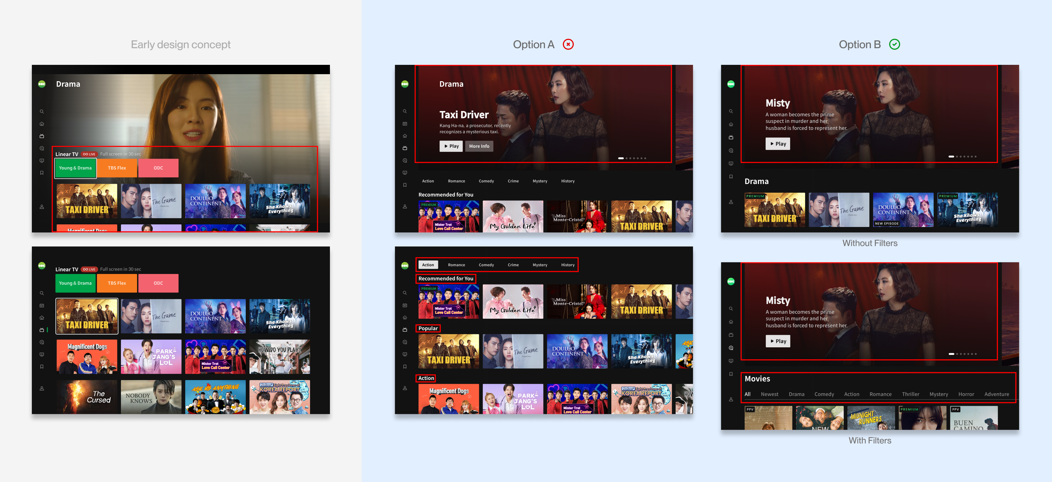
Category: Simplified UI to encourage easier browsing, added banner for promotional content, and aligned with technical constraints on filter availability.
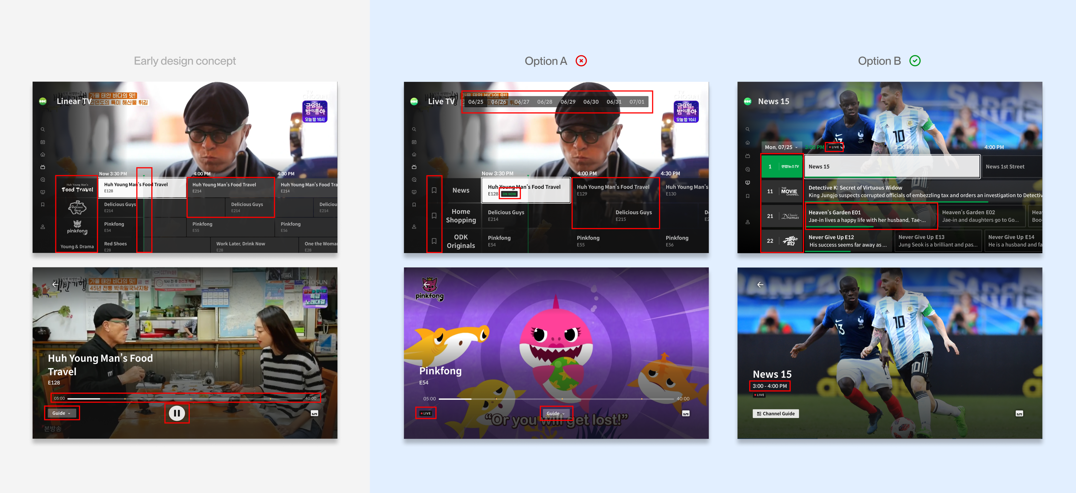
ODK Channels: Live TV feature. Added 7-day schedule, channel logos and numbers, progress bar, more transparent EPG, and Live TV player.
Technical Constraints
Difficult to ensure that all 6 features could be implemented on 7 different platforms
Although all TV apps had the same design, it was difficult as each platform had its own technical or legal issues, which altered the UX/UI in some minor cases. In addition, there were also significant technical limitations which restricted the overall design. In order to meet the quick deadline with multiple features while considering everything, I didn't alter the UI of the original layout a lot, used the Design System as is, and worked very closely with PMs and Engineering (even outside office hours) to ensure that all my designs could be implemented in time.
.png)
Tentative schedule: Each feature's design had around 3-4 weeks.
Usability Test
Users were invited to test on-site after the launch of the TV app
We invited 7 users aged 31-68 (our target audience), who use ODK at least 2-3 times a week, for qualitative interviews to help us improve the app post-launch.
Users were given tasks to complete on Apple TV and Smart TV. The Sign In process and remote usage were the most pressing issues, as they were confused by the order of steps and they also faced challenges with the sensitivity of the Apple TV remote and the usability of the Smart TV cursor.
Users were given tasks to complete on Apple TV and Smart TV. The Sign In process and remote usage were the most pressing issues, as they were confused by the order of steps and they also faced challenges with the sensitivity of the Apple TV remote and the usability of the Smart TV cursor.

Summary of success rate and average rating for 7 participants:
Task success rate is 88.04%; average subjective score is 4.46 (out of 5).
Task success rate is 88.04%; average subjective score is 4.46 (out of 5).
USER FEEDBACK
Overall, users found the new design easy to work with, but struggled with technical issues
“Friendly design. Similar design to other platforms like Netflix. It looks more modern and follows the trends. Simpler, better UI, easier to find contents.”
- User, Aged 31 😄
"Overall, I think it was really good. I could navigate the TV app without thinking too much."
- User, Aged 34 😄
"It’s just the lag that bothers me the most. Search should also have more related content go up quicker [rather than typing everything out]."
- User, Aged 36 😥
"It's my first time using [QR code]. I was confused on choosing how to log in [QR or email]. I’m more used to typing email and PW to sign into the TV."
- User, Aged 54 😥
Outcome
Improving critical design issues based on feedback
Using feedback, I made more design improvements on all screens. These are the screens that required the most design changes based on user and technical needs.
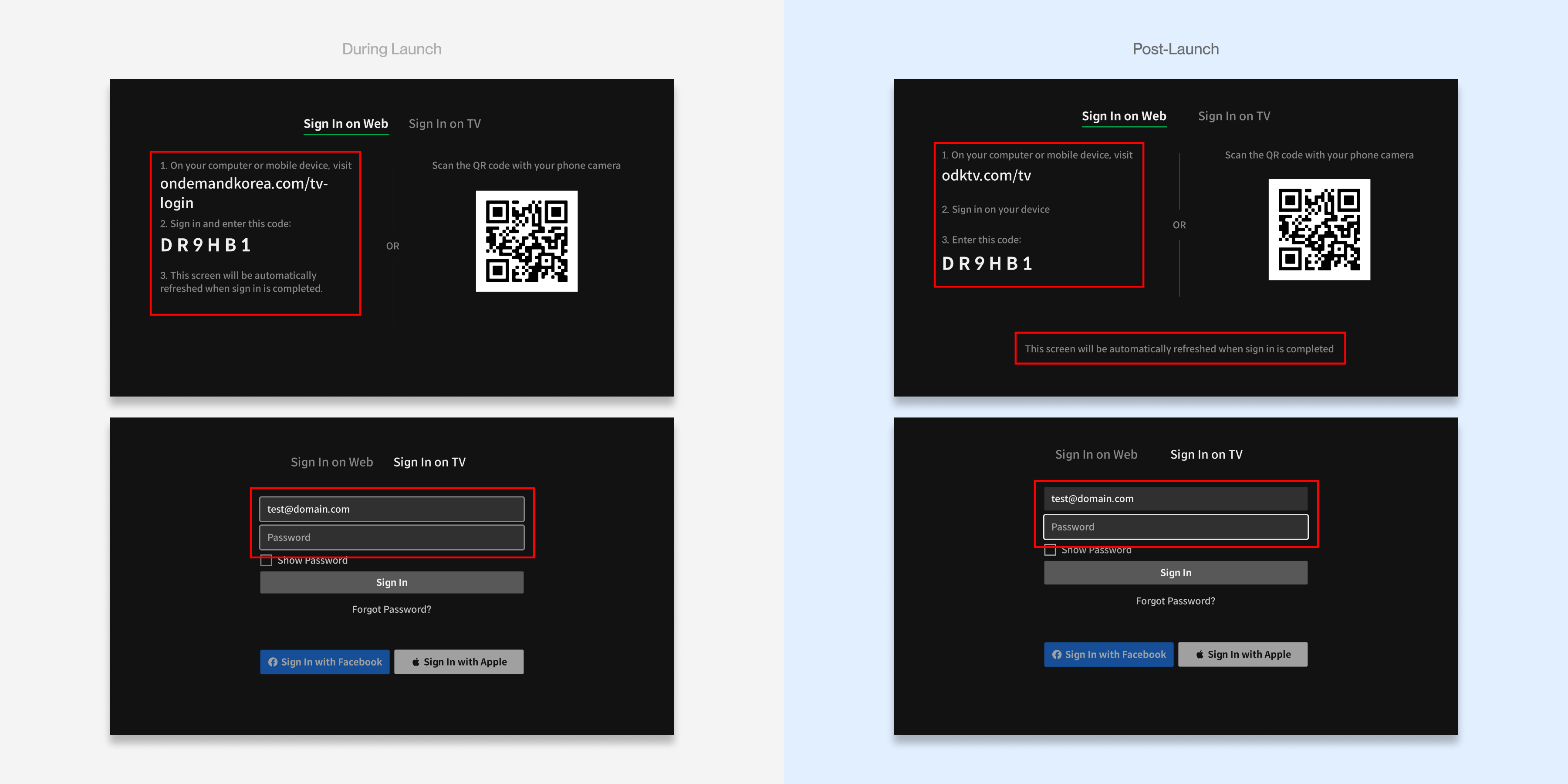
Sign in: Simplified UI and clarified focus state.
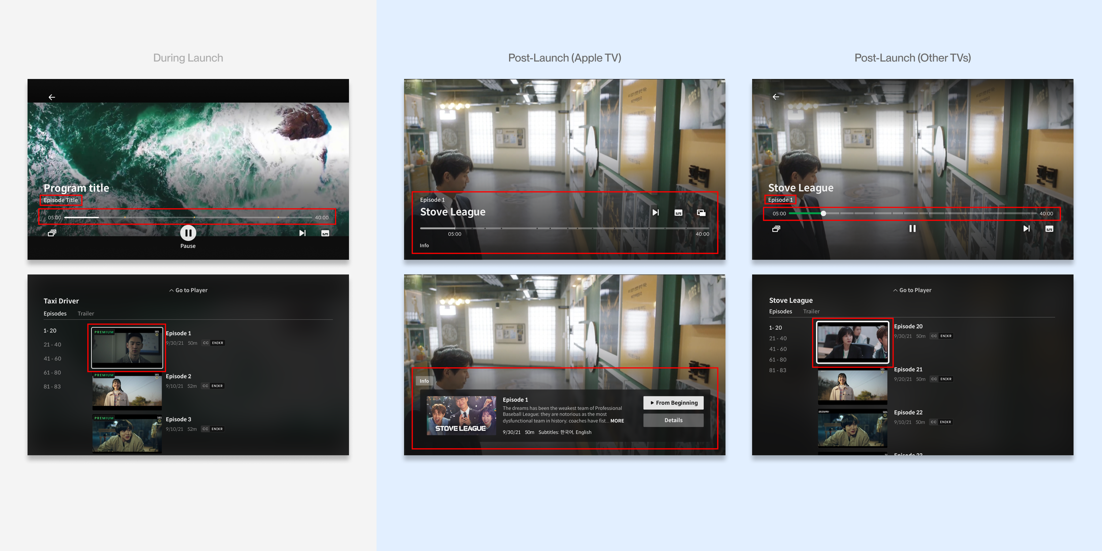
Video player: Due to technical limitations and user feedback, the team decided to prioritize native OS functionality over brand consistency for a more UX friendly experience.
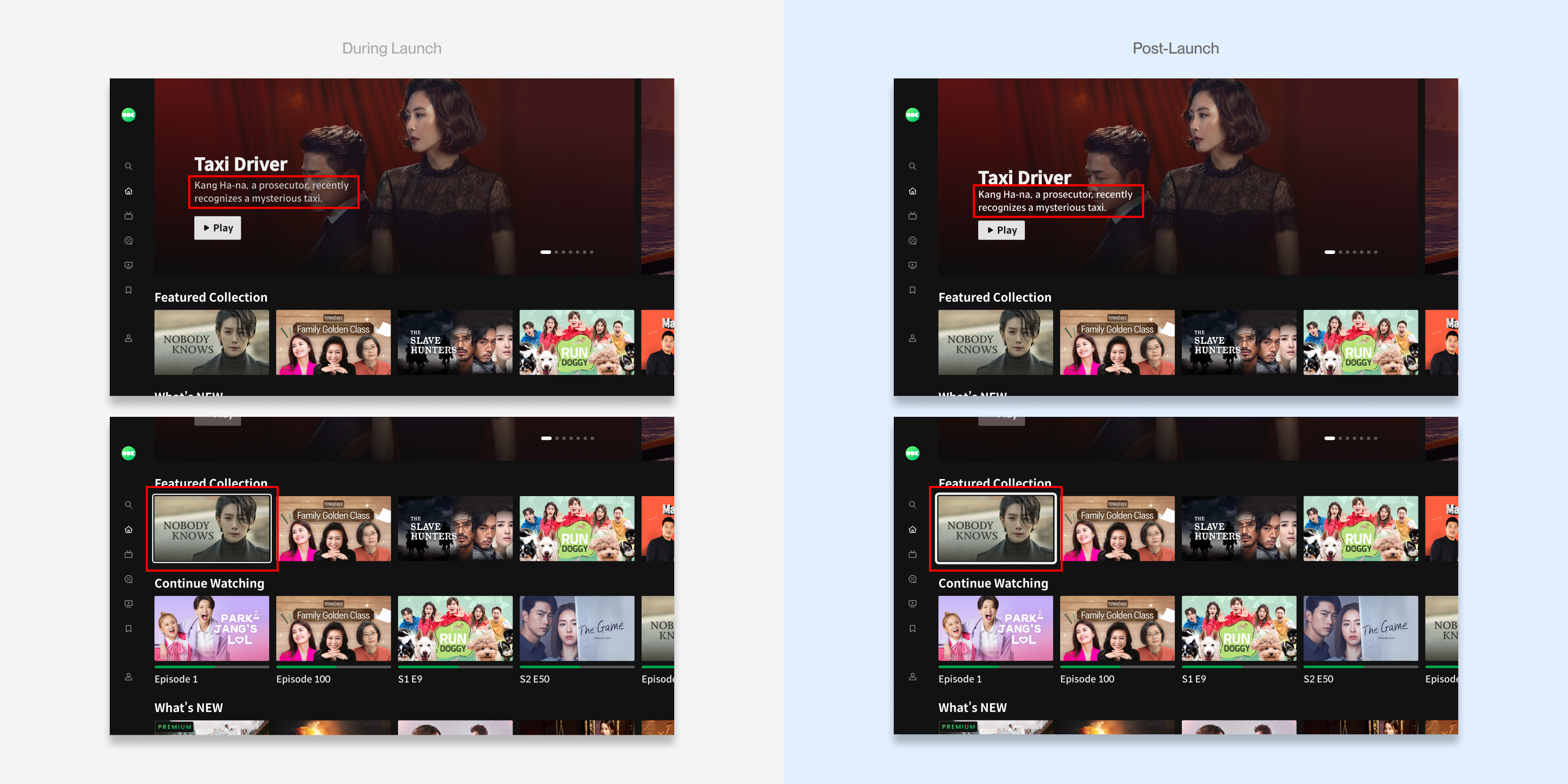
Home: Increased accessibility by making text and focus states when browsing more clear.
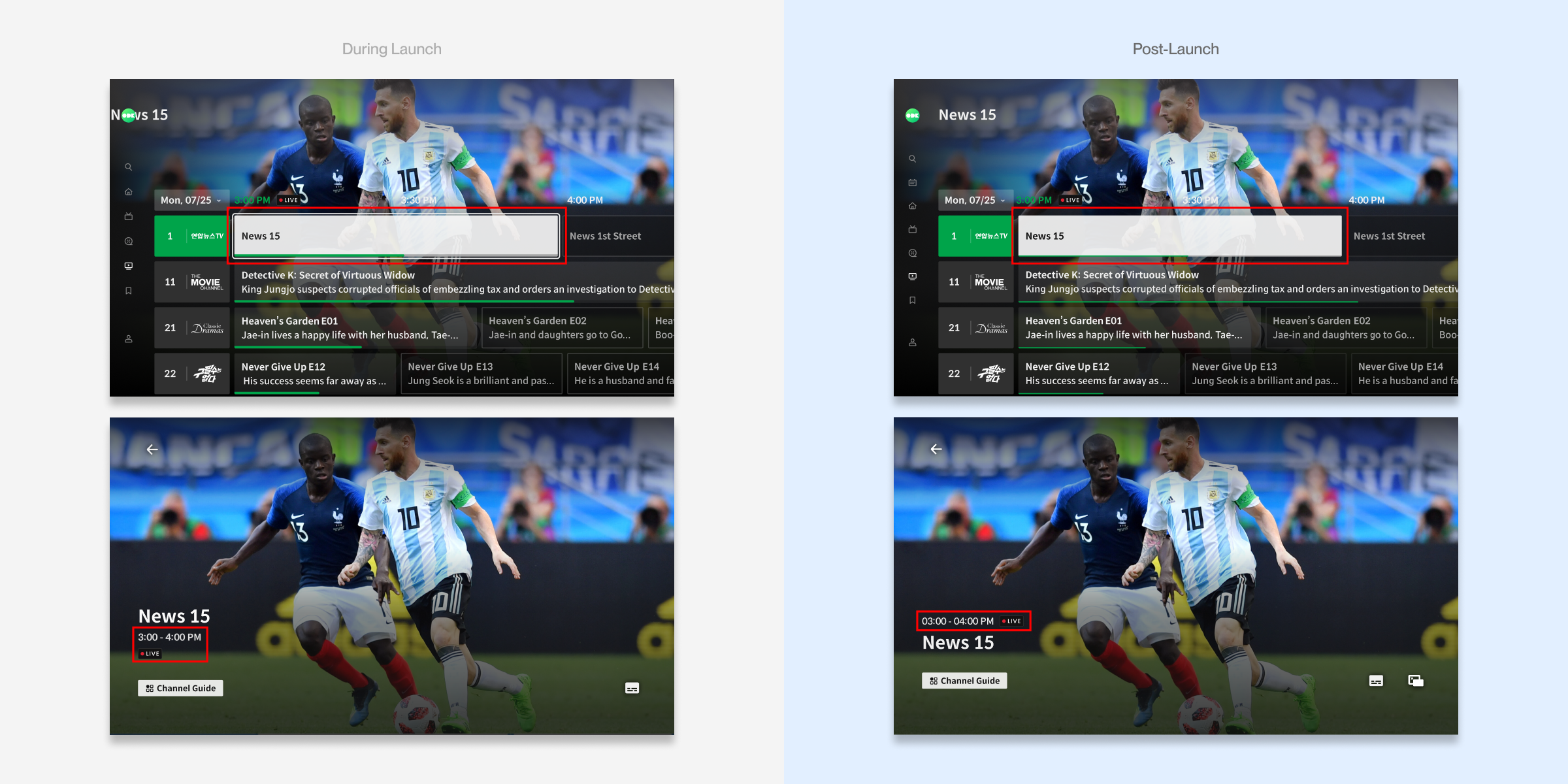
Live TV Guide: Changed focus states due to technical limitations with sticking to original UI and layout for a cleaner UI.
Design System
Unifying the Design System to match all devices
I collaborated with other designers on other platforms to create a more detailed and cohesive design system for TV that follows the same guidelines as other devices (website and mobile app).

Buttons: All platforms must share the same button styles to share brand consistency.

Badges: Promotional badges required same placement across all platforms.
Cross-Collaboration Improvements
Improving Figma organization and design handoff
Upon finishing my design updates, I also reorganized Figma, added more documentation, and updated Jira ticket management to help others have a better understanding of the app.

Documentation: Specified remote behavior clearly for easier handoff to devs and QA.
Ticket management: Created JIRA links and clarified ticket statuses for designers, PMs, and devs to stay aligned.
Setbacks
Too many features and not enough time
Although there were strong initiatives to do a complete overhaul, I believe that introducing new features gradually would be more appropriate. Furthermore, I wish we were able to do more usability testing throughout the design process, especially given that our main users were older individual who may struggle more in getting used to the new product. Also, although the project was very time-sensitive, I regret that we didn't have more time for testing and QA to ensure that it was market-ready.
Reflection
Learning to adapt in a high-stakes project in a cross-functional environment
Through this complex and large-scale project, I've learned the vital importance of clear communication, understanding of technical constraints, and prioritizing the needs of the end user even when plans go awry. This helped me become adaptable along with improving my critical thinking, understanding of business goals, and efficiency at cross-collaboration.
View Other Projects

Venmo
Streamlining group transaction

OnDemandKorea
Reducing user friction
for login
for login

Sav-E
Improving B2C marketing